Showing posts with label Animation. Show all posts

Monday, 23 July 2012

The Importance of Stop-Motion


“There’s always a certain beauty to it, yet it’s unusual at the same time. It has reality. Especially on a project like Nightmare, where the characters are so unreal, it makes them more believable, more solid.” (Thompson, 1993, pg 9)

This quote is from Tim Burton talking about the medium of stop-motion animation, during the filming of The Nightmare Before Christmas (1993).

Stop motion is similar to cell-animation, where images are layered up on clear sheets of celluloid and photographed, different layering’s are then created and photographed so that when played back at speed a character looks like it is moving. Stop Motion works along a similar principal; an animator sets the scene and photographs it, he then moves the character slightly and takes another photograph. When repeated 24 times, this makes up one second of final animation. Although Stop-motion animation may seem like a relatively new filming process (last 20years) but it in fact predates cell animation. (Thompson, 1993, pg 14)

Production companies started using stop motion in the seventies and eighties to produce special effects, such as Industrial Light and Magic in Star Wars (1977), The Terminator (1984) and Robocop (1987). Aardman Animations got in on the action of stop-motion and in 1990 won an Academy Award for Best Animated Short film, with Creature Comforts. Now the multi million pound company is world famous for its Wallace and Grommet stop-motion animations.

Stop-motion is the chosen media for our MA project this year, telling the story of The Magicians Nephew by CS Lewis. We really like the beauty that comes from carefully crafted stop-motion animation, as Burton says in the above quote; it has beauty but is unusual at the same time (Thompson, 1993, pg 9).  It’s made from reality but looks magical- inanimate objects coming to life on camera. It therefore fits well with our project, particularly as the look we are going for is that of highly textured surfaces which you automatically get from stop motion artistry.

It does however come with its own challenges and considerations that need to be accounted for. In one article Tim Burton, whilst talking about the Nightmare Before Christmas, says that although he loves the medium it does present challenges for filming. For one, the audience, he says, can “become overwhelmed by the technique and get distracted from the emotion” (Thompson, 1993, pg 8). So it is important not to let the media take over the story, at the end of the day the medium should assist with the storytelling and enhance the audiences experience, not distract from it.

Another factor that needs to be considered is the strength of the sets where filming occurs. During filming sets have to be strong enough to not only hold the various props and characters but also some of the puppeteers themselves. In a Nightmare before Christmas it was not uncommon to see animators lying down on the sets as they adjusted their characters (Thompson, 1993, pg 147).

Animators need to be able to reach their characters to animate them so on the nightmare before Christmas they divided the bigger sets into smaller sections, having secret doors and openings for the animators to come out of so that they wouldn’t have to reach more than two and a half feet to animate something. (Redmorgankidd, 2009)

Filming moving camera shots can also provide problems. To film panning shots or camera movement­­­­­­­­ involving tracks a new approach is needed. In a live-action film the camera could just film as it moved on the tracks but in stop motion the characters still need to be adjusted so the camera movement has to be considered. To do this one technique is to decide upon the length of the shot, then from this calculate the exact number of frames and then marking these frames as little notches on a piece of tape showing the camera path. After each frame is captured the camera can be moved to the next notch on the tape. When played back, the camera and characters should fit perfectly in sync. (Thompson, 1993, pg 149)

To make a character speak required each animator to have a supply of different facial expressions, so that when put in sequence the character looking like they were talking or singing. (Thompson, 1993, pg 17) The process is long but the final piece benefits from this well loved process.

I think Stop-motion is an amazing medium for filming in, particularly fantasy films, as Burton himself said “It has reality. Especially on a project like Nightmare, where the characters are so unreal, it makes them more believable, more solid” (Thompson, 1993, pg 9). I think this could also be said for the characters of Narnia.


Redmorgankidd, 2009. The Making of The Nightmare Before Christmas (2/3). [YouTube video] Available at: http://www.youtube.com/watch?feature=player_embedded&v=rAATOXkd5pU [Accessed on 23/07/12]

Thompson, F (1993) The Film. The Art. The Vision. Tim Burton’s Nightmare Before Christmas. Disney Editions, New York


Tuesday, 26 June 2012

Work: Narnia- Gate into the Garden

One of the scenes I am designing for is The Garden. This is where the tree from my previous blog post is situated and where Digory plucks a magic apple for Aslan. The Gate has a fairly basic description in the book, just as being Gold, with silver writing on it and surrounded by a wall made of turf. This Concept visual is to represent that gate.

Sunday, 17 June 2012

Inspiration: Bastion

Bastion, in the words of its creators Supergiant Games, is “an original action role-playing game set in a lush imaginative world” (http://supergiantgames.com/?page_id=242)

I really like the visual look of this game; it’s like a moving digital painting. I can see a similar style of illustration in some of my own renderings. The use of colour in the game is effective also to enhance the fantasy element. I like the use of the isometric style view point- this would be a good way of drawing our map for the Magicians Nephew- the simplified perspective makes it easier to draw and easier to read.

I think it would be a good Idea for myself and Hannah to incorporate some bolder character and set combination illustrations as at the moment they two aspects are quite separate in our designs, some beautifully visualised imagery of a character in an environment might help us tie the two aspects together.


I particularly like this image as it seems to bring elements from all the environments within the game into a single representational image- at a glance it shows all the environments. Id quite like to produce something like this but it will have to wait till the end, as I still haven’t designed all the environments yet.

All images from  http://supergiantgames.com/?page_id=242


Wednesday, 4 April 2012

Style: Film references

Using our new Format (see previous post) we found some good film references; some past, some upcoming and some behind the scenes.

The first is Coraline (2009) which is “hand crafted in Stop-motion animation”. The author, Neil Gaiman, says that “Stop motion is such an interesting Medium because there is a realness, but you can also stylize your reality”. Stop motion therefore lends itself for mine and Hannah’s project as we really want the gritty textures of puppets but with that realness of stop motion movement. As said it also allows the reality to be stylised which is a key area in our design concept. In Coraline they also used Post Production effects to remove all the joins from Corallines various face moulds they used- this idea of using CG to enhance the stop motion is something I want to use for the set designs.

“It doesn’t try to be human...it is what it is, it’s very clever and slightly disturbing” Ian McShane


The next film is Frankensweenie (2012) a new Tim Burton film due for release this year. It is another stop motion film with a Post Production finish adding extra details and erasing marks. It looks crisper then a standard Stop Motion render and as said this is something I want to make use of. Its other unique feature is that it is in Black and White. I will be using a similar de-saturated look for Charn when I design it.


ParaNorman (2012) is from the makers of Coraline. It uses Stop motion mixed with some special effects. The movement, especial facial movements, in some of the scenes in the trailer look stunning and quite lifelike while still maintaining their character and texture of stop motion puppetry.

"It allows us to unite the versatility in design and mechanics of CG with the richness and solidarity of physical objects" (themakingof.com)


This final video is a short film by Carlos Lascano; A Shadow of Blue. It’s beautifully made using Stop Motion elements with CG backgrounds, Models, Post Production Animation and Live Action shadows. This is a good clear example of the techniques me and Hannah will be using for our telling of the Magicians Nephew. The puppet and its immediate surroundings, in this case the bench at the start of the film, will be stop motion animated and miniature set builds, with then fully CG backdrops. I also like how they use a key colour of blue near the end of the film, this is the same idea I will use for designing Charn but Red instead of Blue.
 

Friday, 24 February 2012

Pokémon: The Phenomenon

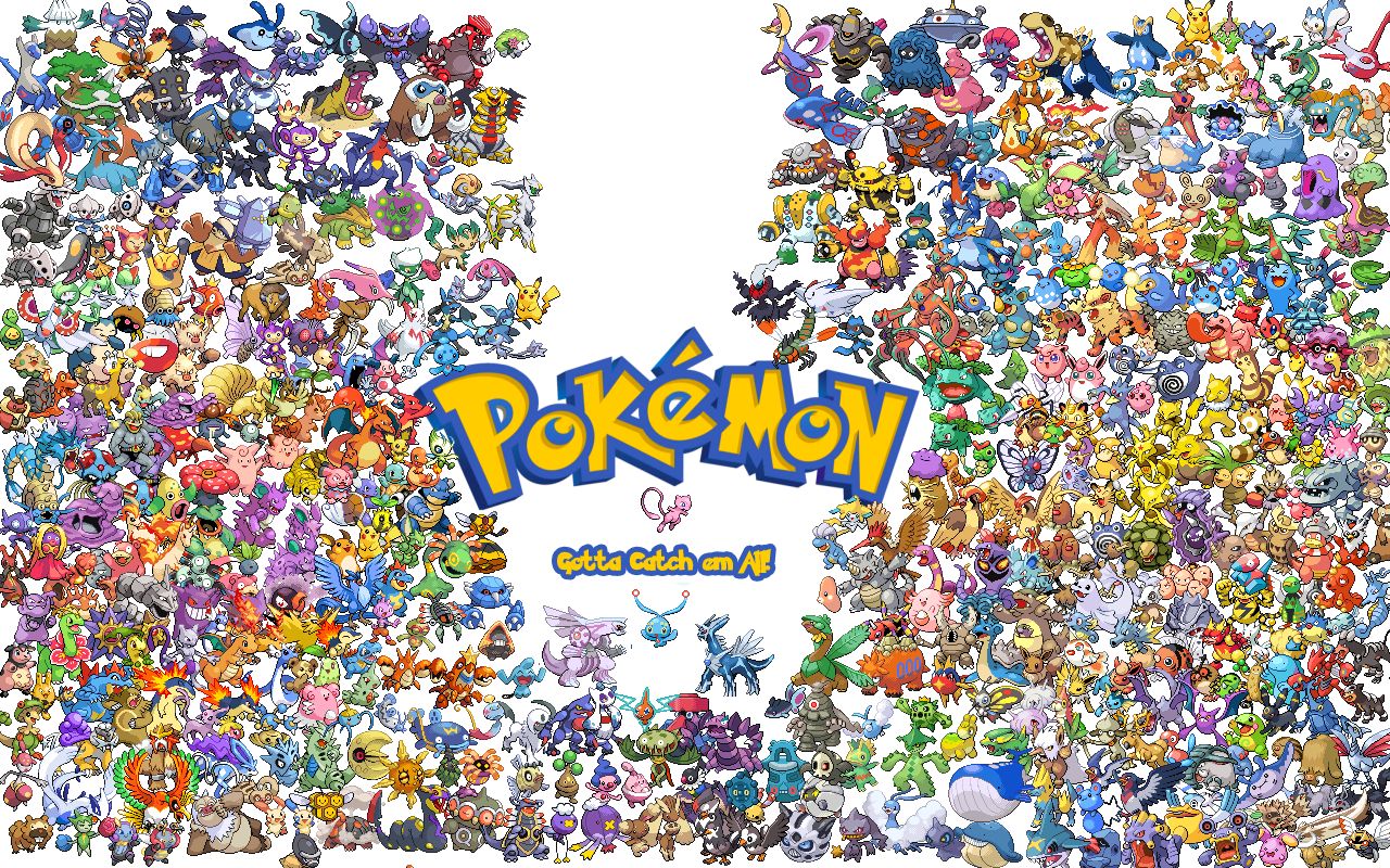
Pokémon Wallpaper accessed 24-02-12
http://fc01.deviantart.net/fs26/f/2008/090/4/9/Pokemon_Wallpaper_by_gamingaddictmike125.png

Pokémon was released in 1996 by Nintendo and Satoshi Tajiri as a simple role-playing video game, it soon became a franchise of anime, manga, trading cards, books, toys and even a TV program and films. The franchise celebrated its tenth anniversary in 2006. Containing over 649 species of “pocket Monsters”, the TV series soon became loved by children all over the world (Bulbapedia). The franchise even has its own website- 16 years after Pokémon first hit the stores (www.pokemon.com/uk/). Films are still being released based on new characters- the first being Pokémon The First Move: Mewtwo Strikes Back (1998) and the latest being film number 14 released in 2011, Pokémon the Movie: Black- Victini & Reshiram and Pokémon the Movie: White- Victini and Zekrom.

I brought some Pokémon cards into Studio and wrote down people’s reactions. Here is a small sample:

“Ahhh...I used to have the cards, I used to play the game. I want to
watch the series again now.”

“Ooh I used to have the cards! Reminds me of the fat one I used to
have...Chansey! It was shiny!”

“Aghh POKÉMON!!”

“I used you really like Pokémon! I liked the fact that they all have
little stories and personalities.”


Here are some of the Pokémon cards that I own:


This is Bellsprout and Weepinbell. There and hundreds of plant based Pokémon. This is a good example of how characters can be created based on a plant theme.


This is Bulbasaur and Ivysaur which are another example of plant based monsters. I really like the flower that grows on the back of Ivysaur.


Dratini and Dragonair are two of my favourite Pokémon. Not necessarily based on their looks, although the ear formation and jewels that grow on Dragaonair are nice, it was more about their back-story. Dratini evolves into Dragonair and both creatures were shrouded in mystery- they were very rare and often considered extinct. This element of mystery made them more appealing to me.


Goldeen and Seaking are fish based Pokémon and they look very beautiful.


This species of Pokémon was very unusual. The basic Pokémon Eevee could evolve into any of the three alternatives. Vaporeon controlled the element of water, Jolteon the element of electricity and Flareon the element of fire. I like the idea of fusing animals with elements.


Metapod evolves into Butterfree. These two Pokémon are clearly based on a chrysalis and butterfly, but with a fantasy twist.


These sets of Pokémon are unrelated. The first is Hoppip (these are Japanese cards). It is another plant Pokémon that resembles a sort of turnip. The fiery Pokémon is Slugma. Slugma is a fire Pokémon that lives in a volcano- I like the idea of animals living in normally inhospitable environments. The final card is Chinchou. It is an electric Pokémon that looks like some kind of bug or Snow Drop flower.


This is Mantine, Magnemite and Dark Gloom. Mantine is based on a Manta ray and Magnemite is based on electrical conductors. I like the way that Magnemite is a living creature yet is made completely of metal and screws. I have included Dark Gloom in here because it shows how the Pokémon franchise created extra character based on existing one. Gloom is the original character but they have adapted her to create an evil version. This could be useful for when I create my own creatures, I could have original creatures in Narnia and Darkversions in Charn.


Porygon is a very unusual Pokémon. It is based on geometric shapes yet you can still tell that it is supposed to be a living organism. This is useful for showing how it’s possible to take an animal design to an extreme based on simple geometry. Onix is a snake-like creature made completely of rock and Rapidash is a horse infused with a fire main and tale.

 
Pokémon is a good reference for how the natural world can be fantasised and adapted to create new species of animals and plants. They created hundreds of animals all with different characteristics and traits and all fitting into an overall ecosystem. I love it

Friday, 17 February 2012

Alice: Madness Returns


"...the worlds that Alice leaps around are stunning, mind bending, and unbelievably cool."
GamePro.com


I recently purchased a book called The Art of Alice: Madness Returns. It’s the design accompaniment for the Video game by American McGee and Spicy Horse Games. The story behind the game is that Alice has recovered from psychotic episode in which she was locked away in an asylum. The game is based on her realisation that the death of her family, for which she blamed herself causing her breakdown, was in fact the doings of another. Just as her own world has been turned upside down and ruined, her beloved Wonderland has also been taken over by a dark force rendering it evil, twisted and on the verge of collapse. Alice must find the evil in both Wonderland and the real world in order to survive.

Ken Wong was the Art Director for Alice: Madness Returns, American McGee and the design team at Spicy Horse Games produced the Art Of book showing stunning visuals and descriptions of the process they went through to create the beautiful yet frightening world of New Wonderland.

The Following is a trailer advertising the game and showing many of the environments Spicy Horse designed for gamers to explore:


Here are some of the images taken from the book that are significant for my own project of the Magicians Nephew:

Martins F, Kerslake B, Lei H, Lei (ART) J, Melo (ART) L (2011) Art of Alice: Madness Returns. Dark Horse Books, Milwaukie


This is the Cover design for the Art Of book. It instantly captures the mood of the game and what people can expect as the venture into the world of Wonderland. This is a good way of showing for a film (or in this case a game), what kind of atmosphere and visual impact a production is going to make.

This is an early exploration for the forest environment by Sun GuoLiang. I love the idea of a floating forest or tree structure, existing in the clouds above us. It feels quite magical.

I like the use of colour in this visual. The monotone effect with a single focus colour works well to create an exciting atmosphere.

This is a good example of clockpunk being graphed onto organic elements. Clockpunk is one of the styles we are going to incorporate into our telling of The Magicians Nephew so as a visual reference of how this can be effectively done this image is useful.

Another example of clockwork being fused with nature (inside the trees).

Again I like the use of colour in this image. The chrome base with highlights of blue work well to create a sinister atmosphere. I also like the illustration of the Caterpillar- this looks like it was done using a graphics tablet.

MAPS!!! Its all about Maps! We really want to create a Map for MN showing how the all the worlds around Narnia link together through The Wood Between The Worlds. This would not only be a useful visual explanation of how the story proceeds but it also has the potential for a beautiful visual.

Another stunning visual incorporating Clockwork. I like the panoramic quality this visual has and good use of colour.

Some examples of how the design department made trees look more 'fantasy-like'- using a stylised colour pallet, mushroom-like canopies and placing it on top of a giant snail.

Nice monochrome visual with a single colour to add significance.

I like the composition of this image- the dark ship at the bottom and swirling light effects overhead.

Nice use of contrasting colours with the Blue being the main colour of the image with highlights of orange. We wanted to use contrasting colours in our design to create drama.

The oriental style motif works well here and its stand-alone nature makes it a nice example of how I could sketch develope ideas before I place them into an exact environment.

This is a good idea for how we could design the elements for Charn (the dying world)- the tower formations would look good as the twisted towers of Charn and the figure heads are useful for Hannah when she looks at the statues of the kings and queens found in Charn's Great Hall.

I like the way this image of the Queen of Hearts Castle has been rendered- it looks like photo collage and illustration combined- the photos give it a realy nice texture giving the whole thing a rough and gritty feel about it.

This is a Colour Script they created to show the different colour schemes and moods through all the different worlds. This is good practice used in the film industry also to show at a glance the kind of mood each location has or needs. We will produce one of these for MN.


I’ve really enjoyed looking through this book- they have made some stunning images and really creative ideas for the environments. I will try and take on board some of their techniques when I do some of the designing for MN. I think Atmosphere is one of the most important things I’ve got from looking through the book- without an appropriate atmosphere a scene will have no depth and won’t look visually interesting, without atmosphere the storytelling cannot be enhanced.

Tuesday, 24 January 2012

Work: Magicians Nephew logo


For my final MA project I am going to produce some concept visuals and set designs for the first Narnia story The Magicians Nephew.

I will be collaborating with Hannah Purdy on this project using Professional Practise techniques so that we both get used to the way the film industry work in the Art department.

We created this logo to use on our work and images to bring all our work together into a coherent working project; providing it with a visual identity as they would do in industry.


Tuesday, 29 November 2011

Film Focus: Origin- Spirits of the Past

This morning I watched Origin: Spirits of the Past (2006) directed by Keiichi Sugiyama. It was epic to say the least. The soundtrack enhances the story so well creating intense emotion hype in the appropriate sequences. I have great respect for the artistry that goes into anime films because each scene has so much fine detail; it’s clear that each shot is carefully planned out with great attention gone into deciding on form, composition, colour, layout etc.

Whilst watching the film I made notes on nature related design element, particularly how nature has been used to create fantasy themes in the film. This post will probably contain a lot of images but it’s worth it as each one looks like a beautifully crafted painting.


All images are stills from Origin: Spirits of the Past (2006)
directed by Keiichi Sugiyama

The film starts off with scenes of a moon being ripped apart by long plant-like tendrils. You later discover that these are genetically modified plant cells breaking free of their lab and descending to earth. This is a good starting sequence because its epic to watch but also quite beautiful to see the familiar object of the moon being broken. The use of using a familiar object within the fantasy setting is an example of Suspension of Disbelief which I have
looked at previously.


This is a still of one dragon-like plant stems racing to earth. This has an element of the Gaia Theory mixed into it as it shows the plant as a kind of sentient, spiritual creature infused with the power of nature.


In the film they briefly show them growing trees on the moon because Earth at this time was incapable of supporting plant life. I think this is interesting because it takes an everyday object like a tree and places it somewhere out of the ordinary and out of context, thus creating the fantasy element.


As I said before seeing something so familiar like the moon suddenly being destroyed instantly captures the imagination of the audience. When I watched this scene in my head I started to ask questions like ‘What would happen if our moon broke apart?’, ‘Would it look like that?’, ‘I wonder what the inside of the moon looks like?’ I was engaged almost immediately.


This shows the moon at night reflecting the light as our own moon does; with however the added element that it is starting to form its own dust
particle rings.


An example of the moon during the day. This is a particularly beautiful scene with lots of detail in the moon but also the trees and cliff face. The colour composition works well here with the purple sky creating an ethereal atmosphere. The overgrown forest instantly telling you this is
not normal civilisation.


In this world Nature has gone wild and covered most of the planet in dense forests and alien-like plants.


The once modern cities are now desolate wastelands left exposed or buried under vast forests.


The genetically modified forest which is able to think and protect itself controls the water supply to the remaining human inhabitants. I like the idea that the forest is a sentient force able to think and communicate. The idea of kami fits again with this element of the story.


The modified plants cover the abandoned skyscrapers like parasitic worms, covering the structures in veins of red roots. This unusual colour helps create a sense of unease about the plants, as red is often associated with danger. The audience recognises plant structures but the red colouring creates a discord from the norm.


The humans can communicate to the forest but only by entering within its boundaries. The fact that humans must approach the forest to communicate puts the forest outside humanities control, allowing it to be free from human influence and making it equal. Humans have no influence over it and that is a scary thought.


Branches of ivy turn into snakes of flora attacking anyone who approaches. The idea that trees can attack twists plants into a force to be feared.


During the film it is revealed that humans can gain special powers from the forest but in exchange will eventually be consumed by the forest. I like this idea because it’s as if nature dooms any person who requests its help. The humans eventually turn into the thing they fear.


One location in the film is a large manmade structure full of machinery and void of plant life. There are similarities between the red pipes seen here and the red root structures seen in the forests elsewhere in the film. This is like Biomimicry which I have spoken about in previous posts- using nature as inspiration for solving human problems.


At the heart of the forest is a large central chamber where the original genetically modified trees first descended to earth. This chamber is filled with lush green plant roots which makes it look almost as if this is where all life stretches from. A complex root structure in the centre holds a spherical object- to me it looks like a sphere of water held in suspense by unknown forces. The blue glow that illuminates this space is beautiful but also quite eerie.


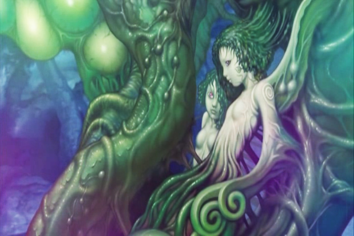
Two humanoid figures are fused with the branches in the middle of the chamber as if they grow with the tree. This fusion of human form and tree can play in the imagination of the audience because we know it is physically impossible...but what if it were?


Two humanoid spirits fusing together through the power of the tree.


At the end of the film it is revealed that not only does the forest consume humans, as shown earlier, but it also gives life to them. This idea of Mother Nature or Gaia being nurturing and caring contrasts entirely with the views of the humans in the film up until this point of realisation.


The main character is reborn from the tree. Gaia theory plays a part here again- the tree gives new life to the main character to keep the balance of good and evil in the world. Nature cares for itself maintaining balance.


Another example of human life being given through the forest.


This final image helps emphasise a point i realised through this film. Fantasy elements can be easily achieved by taking a common object, like a tree, and placing it out of context in an unusual environment. Here a tree is flowering in autumnal colours on a outcrop of rock within a flaming volcano.


From this film I have learnt that effective way to create elements of fantastic nature are to use contrasting environments, fusion elements, colour changes, spiritual entities, elements of the unknown or unexplained and things within the familiar. Some work in response to this is now called for I think...

All images are stills from Origin: Spirits of the Past (2006)
directed by Keiichi Sugiyama