Showing posts with label Interview. Show all posts

Wednesday, 4 April 2012

Work: Redefining Roles

Hannah and I sat down before my placement and discussed at length how we were doing with The Magicians Nephew and how we saw our final product, what it would contain and how it would look etc.


The conclusion from this meeting was that we become “Pre-Visual Artists producing a Concept Outline” for the film. By doing this we were free to be as creative as we liked, fill in detail where detail was needed, and have more time to develop and produce a coherent visual treatment. To back ourselves up we researched practitioners within the field; George Hull, Walter P Martishius and Dawn Brown.


George Hull, Creative Director, ESC Entertainment
CGNetworks Production Coverage
Concept Art Production for the Matrix Reloaded/Revolutions


Commissioned to start helping the visual development process but later moved to the studio to join the Production Designer, storyboard, and Previsualisation artists


Drew design concepts for set interiors and vehicles


The film contained several thousand visual effects so this had him dedicating most of his time to drawing and painting key sequences from the script


“What was unique was the attention the directors paid to concept design and graphic story telling- very refreshing and creatively fulfilling”


Produced about 100 drawings of how set designs, miniature models and visual effects shots should look as well as 100s of colour storyboards including several high-detail production paintings

Pre-visualisation

“The process always starts by talking through the script with the directors and sketching out designs or scenarios: I would then ink in more detail and finish them into colour paintings or storyboards.”

“In post-production, I transitioned to ESC Entertainment as a Senior Visual Effects Art Director – I found the best way to provide art direction was to digitally paint ideas into highly detailed ‘key-frames’. These gave the crew visual targets to help describe precise lighting direction, colour palettes, value, composition and atmospherics.”

“Whenever I start an illustration, I think about the focal point and value composition first. I like images that can be bold enough to make the point in a few seconds, yet subtle enough to have depth and emotion”

“At the beginning of the creative process it is important not to get too tight with your work. For me, the production process starts with me blocking out my designs or storyboards in pencil first and then having the directors check to see whether I am on the right track. Because the Wachowski Brothers wanted considerable detail in the artwork I did, I would almost always ink my pencil drawings into higher design resolution.”

I did this illustration to pitch a few art direction ideas to the brothers

Besides making a scene look dramatic, a concept artist should always try to elaborate on the ideas as well. They don’t always get used, but it is an important part of the creative process.


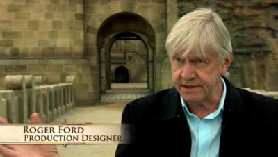
Walter P Martishuius
Production Designer, Art Director, Set Designer

For a Production Designer, concept art is used as a communication tool to convey the look, feel and emotional content of the film as a whole, a set, or moment in the film

“The first use of the art is to express Walter’s vision of the film to the producers. The concept art is Walter’s opportunity to share with everyone what he “sees” for the project. At that point the look and style of the film is either approved or revisions are made. Once everyone agrees on the style, the images are shared as a source of inspiration with the rest of the production company. These images are usually presented in what Walter calls his concept outline. He will do an image for every major movement in the film. This way you can get a feel for the overall look of the flow of the movie. With the concept outline a viewer can see, at a glance, the balance between light and dark, colour, mood, emotion, shape and form as the movie progresses.

The concept outline can be as few as a dozen images or as many as thirty or forty or more.

The concept paintings can then be used by modellers, texture artists, lighting leads and effects artists as reference.


Dawn Brown
Illustrator, Set Designer, Concept Artist
Red Queen’s Castle (Alice in Wonderland 2010)

In Alice in Wonderland she was involved in the conception of the sets for the Red Queen’s Castle.

Worked with Set Decorator Karen O’Hara. Dawn produced concept sketches based on Karen’s direction and Karen showed them to Tim and Rob Stromberg (PD). Dawn the makes revisions to the design or if approved they go to set designers for blueprints then onto the shop to be built.

“Its the small unspoken details that are so important in telling a story like this.”

Most of the animal furniture Dawn created never made it to film but “that’s showbiz”.

For the red Queens castle Karen wanted lots of artwork- Dawn created over 25 pieces but only one was seen in the movie.

She created the environment by talking with Tim and Helena Bonham Carter so it would reflect where her character was coming from.


Sunday, 18 March 2012

Film Focus: The Truman Show

I was watching the Truman Show on TV the other day and one of the characters said something quite interesting:

“We accept the reality of the world for which we are presented”
Truman Show (1998)

In this context the character was saying that even though the world seemed false to the audience, to Truman (the main character) it was perfectly normal.
This links quite well with my project. If a designer can establish a reality at the start of a film it will make it more believable for the audience. If the characters believe it then the audience will believe it.

Sunday, 26 February 2012

Interview with a Production Designer: John Barry

Production Designer John Barry is best known for his work on Star Wars: Episode IV (1977), A Clockwork Orange (1971) and Superman I (1978) and II (1980). Barry started his career in the Art department on the 1963 epic, Cleopatra, Directed by Joseph L. Mankiewicz, and is now well known in the film industry (IMDB). In 1979 Barry collapsed during filming of Star Wars: Episode V (1980), and later died of meningitis, but his imaginative design work still lives on (IMDB).

I was reading a book the other day and came across an interesting quote by Barry:

“I like doing science fiction and fantasy films. You can let yourself go. I prefer designing surrealist things. I find it much easier, too, because you’re free to choose. When you’re in a jam, you can simply change the rules.”
(Ede, L. 2010. P169)

I think this is a really good quote and really helps me with my project. I agree with Barry that designing surrealist things are much more fun as your imagination is the only limit to what you can create. The last part about how you can “simple change the rules” is perfect for answering my research question. To create fantasy nature you just simply change the rules of real nature. You make water plants live on land, small plants large, large plants small, combine animal species, fuse organic and manmade together, the list goes on.

I can simply... change the rules


Ede, L (2010) British Film Design: A history. I.B.Tauris,

Friday, 13 January 2012

Art: Fantasy Island- Heather & Ivan Morison

"The Morisons’ work pushes notions of going green and alternative culture into the realm of alternate reality, largely through their interest in the literary genre of science fiction."


This installation was designed and made by Heather and Ivan Morison. The installation is located in an area of woodland in Northwest Wales. The structure uses wood from within the forest so as an old tree dies, it is replaced with a new tree and the wood cut up and used for building new structures, this ecological approach makes the structure look like it belongs within the forest, nestled amongst it brothers and sisters.

The style is based on the geodesic shapes of 1970s utopian architecture and the idea of do-it-yourself handicraft. The shape and structure was inspired by a rock the couple found whilst travelling through America. It reflects the couple’s interest in nature and the fantastical. This links well with my project as they are artists who create natural structures with a fantasy twist.

From the outside the structure looks strange and alien, creating a sense of danger but inside a small wooden stove provides the cabin with a warm ambiance creating an environment of refuge and safety.

I really like the looks of this cabin- its bulging shapes contrast with the organic landscape yet it looks at peace nestled within the trees. I have always wanted to build my own house within a forest. I love the idea of escaping the hustle and bustle of the manmade city environment and taking refuge in a wooden house hidden amongst the trees of a forest. One day I AM going to build my house in a forest!

fantasyisland03 accessed 13-01-2012

fantasyisland04a accessed 13-01-2012

fantasyisland05 accessed 13-01-2012

fantasyisland09 accessed 13-01-2012

fantasyisland10 accessed 13-01-2012

Saturday, 7 January 2012

Technique: Digital Speed Painting

The way I render images I produce is a collage based technique similar to what’s known in the film industry as Matte Painting. I layer up photographs, textures and colours to produce a rendered image. I want to experiment with some other forms of rendering particularly for producing concept images. I purchased an ImagineFX: Fantasy & Sci-fi Digital Art magazine and noticed that the majority of the concept art pieces were produced by painting with Photoshop. Digital painting uses similar painting techniques to normal painting but with the added convenience of full digital editing capabilities.


The following video is one of the videos I found that shows you how to digitally paint in Photoshop. The notes from the video are listed bellow.


Drawing from your mind concept art tutorial environment magma river

  • Landscape orientated images look more cinematic
  • Have an idea of the look before you start but don’t rigidly stick to it
  • Don't need to focus to heavily on perspective when drawing organic shapes
  • Simple layouts are best when incorporating a Foreground, Midground and Background
  • Determine the chromatic value range before you start
  • Keep colour values simple- 3-5max with a dominant colour- using an overlay layer filter
  • Use contrasting colours to create atmosphere and more striking form
  • Values become more washed out as the move towards the background


Here are some more digital painting videos that use nature as their main theme. The second video creates a particularly stunning image of a forest. When I return to university next week I want to try reproducing some digitally painted concept drawings using a graphics tablet in photoshop.


Speed painting - Soul of the forest.


  Green forest speed painting

Thursday, 24 November 2011

Theory: Biomimicry

“The answers to the questions we’ve been asking...are all around us”
Janine Benyus

Biomimicry is design, inspired by nature. Using the principles of science and investigation, a new wave of designers are identifying how nature can help solve design problems most effectively. Janine Benyus, President of the Biomimicry Institute, is at the forefront of the movement.

What is Biomimicry? Accessed 24/11/2011 11:09am

Nature has been designing since time began and has been doing so very successfully. Humans on the other hand have been designing awkwardly solving short term problems in the best way we can. Using nature as a blueprint, scientists and designers have been adapting natures design to solve human problems across world. The following are some examples of how natures design has been adapted to improve human design.
http://upload.wikimedia.org/wikipedia/commons/9/92/Crystal_Palace_from_the_northeast_from_Dickinson's_
Comprehensive_Pictures_of_the_Great_Exhibition_of_1851._1854.jpg

The Crystal Palace accessed 24-11-11  3-37pm
The Crystal Palace, built for the 1851 World Expo by Joseph Paxton, was inspired by the ribbing structure of the giant Amazon Victoria Water Lilly.

http://24.media.tumblr.com/tumblr_kpc5ivmjFk1qzs2oxo1_500.png
Amazon victoria water lilly accessed 24-11-11  3-37pm
Using a similar structure that the water lily uses on its giant lily pads, Paxton was able to create the huge greenhouse-like building which due to the amount of glass panelling had never been possible before.


Another example is that of the humpbacked whale. On the whales fins are small bumps, when transferred onto the blades of a wind turbine they increase the efficiency by 32%.

http://www.baltimoreseasafari.ie/data/images/humpback_whale's_pectoral_fin_-_courtesy_of_simon_duggan.jpg
Humpback whale fin accessed 24-11-11  3-38pm

http://wpcore.wpe.s3.amazonaws.com/wp-content/uploads/2009/09/whale-power.jpg
WintV turbine wing accessed 24-11-11  3-38pm

Biomimicry can also be incorporated into design for film sets too.; adapting patterns, structures, colours, shapes, sizes, textures etc into architecture, furnishings, environments, clothing and so much more. As Jenine Benyus said, the answers are all around us.


Thursday, 27 October 2011

Film focus: The Nightmare Before Christmas

“An eerie world of imagination comes to life before our eyes”
The Making of Tim Burtons the Nightmare before Christmas


The Nightmare before Christmas is one of my favourite Disney films of all time, bringing stop motion animation into the limelight.


Part 1/3
The Making of Nightmare before Christmas 1/3 accessed 09-10-2011 12-28pm


Part 2/3

The Making of Nightmare before Christmas 2/3 accessed 09-10-2011 12-28pm


Part 3/3
The Making of Nightmare before Christmas 3/3 accessed 09-10-2011 12-28pm


It took 100 artists and technicians, 13 animators, over 100 camera operators, puppet makers, set builders and prop makers 3 years from start to finish to produce Tim Burton’s vision. Using 19 sound stages, 230 sets and hundreds of individual puppets.
Through the hard work of all these people the film won Best Fantasy Film from the Academy of Science Fiction, Fantasy & Horror Films, USA in 1994.

https://blogger.googleusercontent.com/img/b/R29vZ2xl/AVvXsEity069Q5K_Z9I8gw6y3w34edwrPrAFIfUfKEeKRhuMoXnuLn5RXucN9EAfhsOlNx_P_S9nZoSaHyTZD72oPQv-vMsCviiPN4vuIGwZmclADf1JsuutD8smN1peAa1VlsrUYid0wwAVJj8/s1600/ortho_shot+copy.jpg
Nightmare before christmas set sketch accessed 9-10-2011 6-38pm

The basis of the film came from Tim Burton’s original poem and artwork entitled The Nightmare Before Christmas. Using the artwork, the art department created characters, sets and locations that coincided with Tim’s original drawings. Tim Burton was head of the visual team so in one sense could take on the title Production Designer, though he never did.


http://animationarchive.net/Non%20Feature%20Films/The%20Nightmare%20Before%20Christmas/Concept%20Art/PDVD_168.jpg
Nightmare before christmas jack skelington accessed 9-10-2011 6-30pm

http://animationarchive.net/Non%20Feature%20Films/The%20Nightmare%20Before%20Christmas/Concept%20Art/PDVD_400.jpg
Nightmare before christmas gate concept accessed 9-10-2011 6-33pm

This film, like many, relied heavily on the use of storyboards in the Pre-production stage to save time and money by planning out the whole film before any filming began. Joseph Ranft was the Storyboard Supervisor and with his storyboarding team they drew scene after scene of storyboards, many scenes containing several shots, until they had the full film, accompanied by voice over’s and music. This method of planning a film before shooting allows the director to see his vision before any filming begins and allows any problems to be solved quickly saving hundreds of thousands of pounds.

http://s3files.core77.com/gallery/images/2008_NY_toy_34.JPG
Nightmare before christmas set model accessed 9-10-2011 6-36pm

The look of the film was taken from Tim’s original sketches- the entire set was covered in plaster and then etched into, creating cross hatching and texture so it looked like a living illustration.

Tim had a strong emphasis on colour and told the set designers that the only colours they could use in their colour pallet for Halloween Town were black, white and orange. This emphasis on narrow colour choices created the scary look of the town which fits perfectly with the overall theme.

Post-production techniques were also used to add snow, smoke, shadows, fire, electric bolts and floating ghosts.

http://home.comcast.net/~wardandandrea/treehouse.jpg
Nightmare before christmas set accessed 9-10-2011 6-36pm

Friday, 7 October 2011

Interview with a Production Designer: Roger Ford

“...One of the characters is the building...”
“So, in a sense, when we tried to develop the exterior of the castle, I'm trying to put a character into the movie and make it reflect the Telmarine culture. It's imposing in
its own right.”
George Miller and Roger Ford

Here are some examples of work by the Production Designer Roger Ford. I am particularly interested in his work he did on Narnia: The Lion the Witch and the Wardrobe, Narnia: Prince Caspian and Peter Pan.

Roger Ford- Production designer for Narnia:Prince Caspian
http://www.narniaweb.com/wp-content/uploads/2009/07/4635-400x226.jpg
accessed 07/10/2011 2:11pm


Written interview: Roger Ford, production designer for "The Chronicles of Narnia: Prince Caspian"
Accessed 07/10/2011 12:03pm


I find his set designs for the Narnia films very creative and just seeing images of them gets my imagination excited. He mixes the ethereal snow covered forests with the ice laden palace of the white witch to produce an incredibly diverse setting for a classic children’s story. He was nominated for the Excellence in Filmmaking award by the 2006 Australian Film Institute and the film The Lion the Witch and the Wardrobe won Best Family Film in 2006 at the Broadcast film Critics Association Awards.


Narnia: The Lion the Witch and the Wardrobe
Magical Narnian Forest
http://www.dan-dare.org/FreeFun/Images/CartoonsMoviesTV/LionWitchWardrobeWallpaper1024.jpg
Accessed 7/10/2011 1:24pm

Narnia: The Lion the Witch and the Wardrobe
http://uk.movies.ign.com
Accessed 7/10/2011 1:30pm


Narnia: The Lion the Witch and the Wardrobe
Cair Paravel Concept art
http://s3.amazonaws.com/data.tumblr.com/tumblr_l5rva3IJFB1qc1m43o1_1280.jpg?AWSAccessKeyId=AKIAJ6IHWSU3BX3X7X3Q&Expires=1318075748&Signature=
TgFfOuodLt4ceCryeZfxtJoQwRg%3D

Accessed 7/10/2011 1:32pm

Narnia: The Lion the Witch and the Wardrobe
Witch's Castle
http://www.stardusttrailers.com/scheda_wallpaper_read.php?id=876&titolo=The Chronicles of Narnia: The Lion, the Witch and the Wardrobe&id_wallpaper=6675
Accessed 7/10/2011 1:29pm

Narnia: The Lion the Witch and the Wardrobe
Aslans How
http://uk.movies.ign.com
Accessed 7/10/2011 1:38pm

Narnia: Prince Caspian
Concept Art
http://www.comingsoon.net/films.php?id=36746&offset=10
Accessed 7/10/2011 11:17am

Narnia: Prince Caspian
Dancing Lawn: Concept Art
http://www.comingsoon.net/films.php?id=36746&offset=10
Accessed 7/10/2011 11:15am


Narnia: Prince Caspian
Cair Paravel Ruins
http://narnia.wikia.com/wiki/Cair_Paravel
Accessed 7/10/2011 1:31pm

Peter Pan
Reacuring two-tone colour scheme
http://www.scenicreflections.com/files/Peter_Pan:2003_Wallpaper_JxHy.jpg
Accessed 7/10/2011 1:34pm

Peter Pan
Stylizing: almost paint like designs
http://imageshack.us/f/220/2kd6sgxs1nsu4iawudgk003.jpg/
Accessed 7/10/2011 1:36pm

Peter Pan
Two-tone design
http://outnow.ch/Media/Movies/Bilder/2003/PeterPan/movie.xl/02.jpg
Accessed 7/10/2011 1:34pm

Peter Pan
Colourful environments heavily stylized and colour enhanced
http://twilightswarden.files.wordpress.com/2011/03/peter_pan_12.jpg
Accessed 7/10/2011 1:37pm

Wednesday, 5 October 2011

Empire: A look around Pixar Animation Studios


“It’s Pixar, the coolest place on the planet” Chris Hewitt


Pixar animation studio
accessed 05-10-2011 04-20pm

Accessed 05-10-2011 3:47pm


The above link is a short documentary by Empire Magazine, looking around Pixar Animation Studio in Emeryville, California. Chris Hewitt interviews some of the members of Pixar who were involved in their latest release UP, including Pete Doctor who was the Director and Screenwriter.

I am a huge fan of all things Pixar and it is my dream to one day work for these giants of animation magic.

Interview with a Production Designer: John Myhre

"Its all about Story telling" John Myhre


This video is an interview from the 2011 San Diego Comic-Con, with John Myhre who was the Production Designer on “Pirates of the Caribbean: On Stranger Tides”.

He starts off by briefly explaining what his role was as production designer was in the film and how exciting and creative this job is. It’s so good to see someone really enamoured with their work and as this is the job I want to go into one day it’s really inspiring and fills me with excitement and anticipation for projects I may get to work on one day.

It’s an interesting video because Myhre goes into detail on how he came up with the concept for the ship sailed by the infamous pirate Blackbeard, the Queen Anne’s Revenge. Many details go unnoticed by the audience but it’s very interesting hearing where certain elements of the design come from; for example the menacing skeleton on the bow of the ship where the figurehead should be, holding a spear and a goblet, is taken from motif that appears on Blackbeard’s flag:

I will investigate more of John Myhre’s work.


Blackbeards ship showing skeleton motif
accessed05-10-2011 11:39am

Blackbeards ship2
accessed 05-10-2011 11:40am

Blackbeards flag and skeleton motif
accessed 05-10-2011 11:41am