
Showing posts with label Drawing Techniques. Show all posts
Showing posts with label Drawing Techniques. Show all posts
Monday, 11 June 2012
Work: Charn- Window of the Gods NEW render
I previously
uploaded a render of “the window of the gods” showing the stained glass detail.
Now I’ve done a complete rendering of the whole wall that runs the length of
the Great Hall. On this version of it I’ve overlaid the brick pattern and CAD
brickwork to show greater detail. I think it works quite well to get across a
basic understanding of the style and atmosphere.


Work: Charn- CAD for laser cutting
These are the CAD
files I had to make for laser cutting my model of Charn’s Great Hall. I’m going
to go see the technician shortly to check the files are correct and then
fingers crossed start cutting. I rekindled my
relationship with AutoCAD to produce the files, and past experience taught me
that curves are evil so thankfully a lot of the design was strait lines and
repeated patterns.


I hope it looks
good once made.
Thursday, 10 May 2012
Work: Dancing Lawn
This scene originally
only started out as another tree concept, but as I got into it it sort of
developed into a whole scene.

I wanted to do some more sketching because I don’t really do much actual sketch rendering, I develop my designs through sketch but once I have the basic forms I then put it into the computer and run it through Photoshop. So I wanted to have a go a sketching a design to completion, if nothing just for my portfolio.
 I then added some
colouring in Photoshop and added some extra shadows for a more three
dimensional feel. I’m quite pleased with it now it’s done, and it may become
one of the visuals for the EXPO, as it’s the size of an A2 page.
I then added some
colouring in Photoshop and added some extra shadows for a more three
dimensional feel. I’m quite pleased with it now it’s done, and it may become
one of the visuals for the EXPO, as it’s the size of an A2 page.
The basis for the
design is around the location called “Dancing Lawn” it doesn’t actually appear specifically
in the Magicians Nephew but it does appear in some of the later books. It could
however be incorporated in some way into our film adaptation.
I wanted to play
more with the idea of natural geological formations rather than just looking at
individual trees. I wanted the area to look like the natural stone had been
forced up and then a giant tree had grown across the central expanse, creating
a sheltered cave-like space. To link with the Dancing Lawn idea where Narnian
creatures could gather and throw outdoor celebrations I’ve played with the Idea
that they have built bridges to connect all the stone monoliths together,
allowing access to the larger grassland area. Giant Mushrooms also grow on the
white stone forming smaller platforms around the larger rocks.

I wanted to do some more sketching because I don’t really do much actual sketch rendering, I develop my designs through sketch but once I have the basic forms I then put it into the computer and run it through Photoshop. So I wanted to have a go a sketching a design to completion, if nothing just for my portfolio.

Friday, 17 February 2012
Alice: Madness Returns
"...the worlds that Alice leaps around are stunning, mind bending, and unbelievably cool."
GamePro.com
I recently purchased a book called The Art of Alice: Madness Returns. It’s the design accompaniment for the Video game by American McGee and Spicy Horse Games. The story behind the game is that Alice has recovered from psychotic episode in which she was locked away in an asylum. The game is based on her realisation that the death of her family, for which she blamed herself causing her breakdown, was in fact the doings of another. Just as her own world has been turned upside down and ruined, her beloved Wonderland has also been taken over by a dark force rendering it evil, twisted and on the verge of collapse. Alice must find the evil in both Wonderland and the real world in order to survive.
Ken Wong was the Art Director for Alice: Madness Returns, American McGee and the design team at Spicy Horse Games produced the Art Of book showing stunning visuals and descriptions of the process they went through to create the beautiful yet frightening world of New Wonderland.
The Following is a trailer advertising the game and showing many of the environments Spicy Horse designed for gamers to explore:
Here are some of the images taken from the book that are significant for my own project of the Magicians Nephew:
Martins F, Kerslake B, Lei H, Lei (ART) J, Melo (ART) L (2011) Art of Alice: Madness Returns. Dark Horse Books, Milwaukie
 |
| This is the Cover design for the Art Of book. It instantly captures the mood of the game and what people can expect as the venture into the world of Wonderland. This is a good way of showing for a film (or in this case a game), what kind of atmosphere and visual impact a production is going to make. |
 |
| This is an early exploration for the forest environment by Sun GuoLiang. I love the idea of a floating forest or tree structure, existing in the clouds above us. It feels quite magical. |
 |
| I like the use of colour in this visual. The monotone effect with a single focus colour works well to create an exciting atmosphere. |
 |
| This is a good example of clockpunk being graphed onto organic elements. Clockpunk is one of the styles we are going to incorporate into our telling of The Magicians Nephew so as a visual reference of how this can be effectively done this image is useful. |
 |
| Another example of clockwork being fused with nature (inside the trees). |
 |
| Again I like the use of colour in this image. The chrome base with highlights of blue work well to create a sinister atmosphere. I also like the illustration of the Caterpillar- this looks like it was done using a graphics tablet. |
 |
| MAPS!!! Its all about Maps! We really want to create a Map for MN showing how the all the worlds around Narnia link together through The Wood Between The Worlds. This would not only be a useful visual explanation of how the story proceeds but it also has the potential for a beautiful visual. |
 |
| Another stunning visual incorporating Clockwork. I like the panoramic quality this visual has and good use of colour. |
 |
| Some examples of how the design department made trees look more 'fantasy-like'- using a stylised colour pallet, mushroom-like canopies and placing it on top of a giant snail. |
 |
| Nice monochrome visual with a single colour to add significance. |
 |
| I like the composition of this image- the dark ship at the bottom and swirling light effects overhead. |
 |
| Nice use of contrasting colours with the Blue being the main colour of the image with highlights of orange. We wanted to use contrasting colours in our design to create drama. |
 |
| The oriental style motif works well here and its stand-alone nature makes it a nice example of how I could sketch develope ideas before I place them into an exact environment. |
 |
| This is a good idea for how we could design the elements for Charn (the dying world)- the tower formations would look good as the twisted towers of Charn and the figure heads are useful for Hannah when she looks at the statues of the kings and queens found in Charn's Great Hall. |
 |
| I like the way this image of the Queen of Hearts Castle has been rendered- it looks like photo collage and illustration combined- the photos give it a realy nice texture giving the whole thing a rough and gritty feel about it. |
 |
| This is a Colour Script they created to show the different colour schemes and moods through all the different worlds. This is good practice used in the film industry also to show at a glance the kind of mood each location has or needs. We will produce one of these for MN. |
I’ve really enjoyed looking through this book- they have made some stunning images and really creative ideas for the environments. I will try and take on board some of their techniques when I do some of the designing for MN. I think Atmosphere is one of the most important things I’ve got from looking through the book- without an appropriate atmosphere a scene will have no depth and won’t look visually interesting, without atmosphere the storytelling cannot be enhanced.
Friday, 10 February 2012
Work: Rendering Techniques
I’ve been experiment some more with Illustrator by attending some Illustrator workshops organised for Fashion and Textile students. They have been very useful and by doing some of my own experimenting I think I have now got to grips with some basic Illustrator techniques.


I started doing some sketches of some fantasy plants as a response to the research I did earlier on “Weird looking plants”. I will talk about this in more detail later on. I experimented with rendering techniques using some newly gained Illustrator skills and some recently developed Digital painting techniques in Photoshop. I like both results but for the purposes of showing a concept and texture I think the Photoshop one work better.


Monday, 6 February 2012


Thursday, 24 November 2011
Life Drawing: Female 22/11/2011
“There is no excellent beauty that hath not some strangeness in the proportion”
Francis Bacon
I went to Life Drawing again this week. Its been a while and was a bit difficult to get back into the swing of it but it eventualy came back.


Ive been trying to add some kind of shading to my sketches to try and create a sense of 3D. Ive never been told how to sketch and its proving difficult- I find it hard to identify the dark and light shades (rediculus though that sounds)


Monday, 14 November 2011
Life Drawing: Male 01/11/11
“I chose faces and figures as my subject matter simply due to the fact that the human form is already beautiful art”
Frank Bruno


I think my drawings of the human form are improving nicely now but I still need to work on shading and final rendering techniques. In our tutorial class the other day we asked if we could have some extra classes on location drawing and architectural drawing as the majority of the things I will have to design in the future will be physical spaces and sets rather then people.
Saturday, 29 October 2011
Life Drawing: Male 26/10/2011
“Practice by drawing things large, as if equal in representation and reality. In small drawings every large weakness is easily hidden; in the large, the smallest weakness is easily seen.”


Life Drawing: Male 18/10/2011
“Draw as much and as often as you can. When drawing lies fallow, the skill diminishes.”
Gene Black
Gene Black


Monday, 17 October 2011
Life Drawing: Female 12/10/2011
"It is through drawing that masters are first revealed; through drawing that they live and prove their value, whatever variations they may impose on their talent."
Gerard Bauer
When I was younger I used to copy characters from one of my video games so from a young age I was used to drawing the female figure- as a result I found the female life drawing session much easier then the previous male one. I am much more familiar with the body shapes and curves of the female form.

This first warm up sketch is a little inaccurate but i think it is an improvement on the male form i drew at the first drawing class.
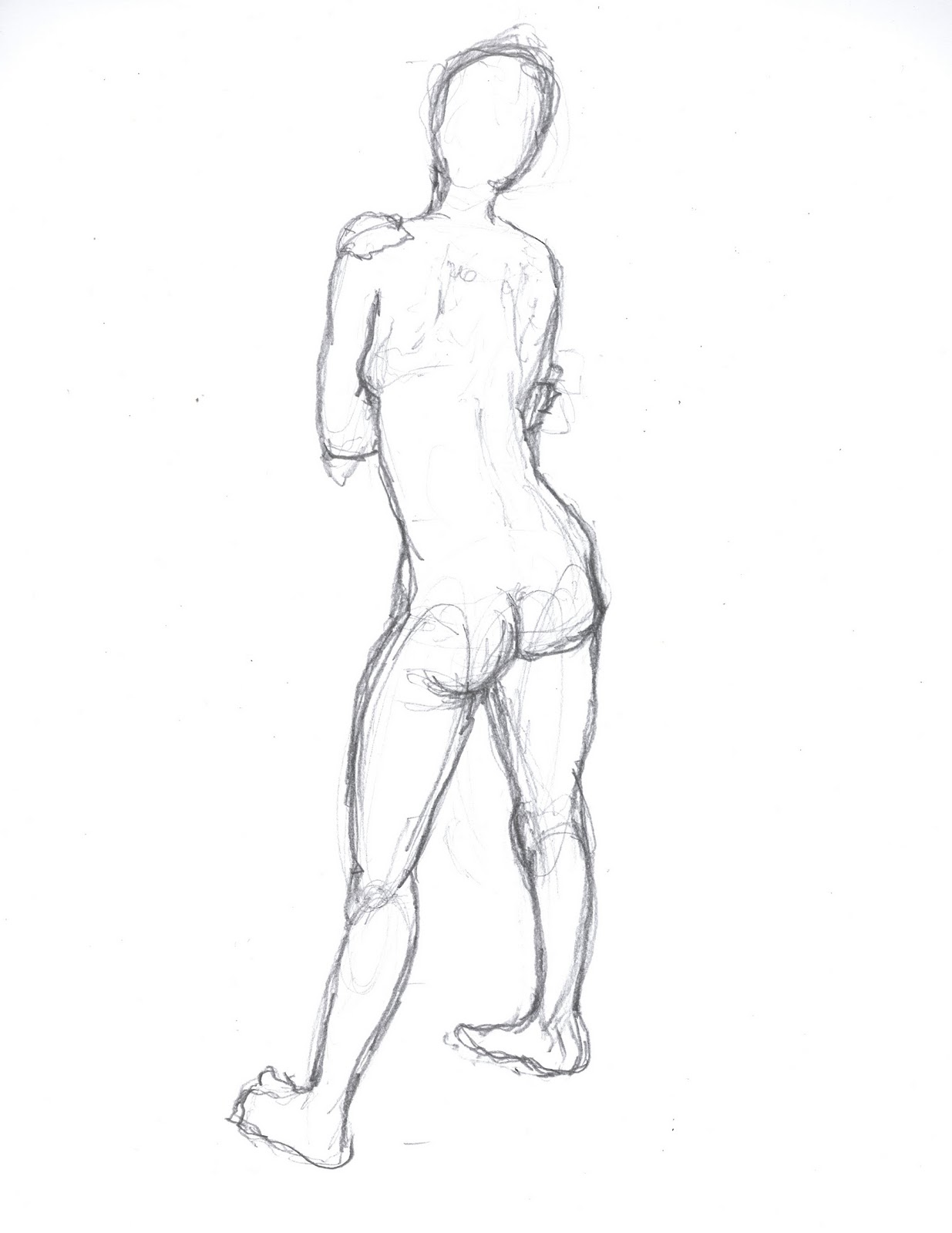


The last four images I think are some of the best I have drawn. Because I already had a basic knowledge of drawing the female figure i found the session much more enjoyable.
Life Drawing: Male 11/10/2011
"Do not fail, as you go on, to draw something every day, for no matter how little it is, it will be well worthwhile, and it will do you a
world of good."
Cennini
To help improve my drawing ability I’ve joined a life drawing class at uni. The idea behind it is that you learn to look, and then draw what you see rather than drawing what you think you see.
The first few minutes felt very weird. I was sat in a room with 20 other students all drawing a naked person. Not something I had done before. But after a while it didn’t feel so weird and I almost forgot that there was a naked person there because I was concentrating so hard on my drawing.

My first couple sketches were quite poor. They were not very accurate and the proportions were a bit out, but the idea was just to get warmed up and focused.


The next few images were longer 20minute poses and this time we had to focus on accuracy but measuring the model with you pencil at arm’s length.


My sketches greatly improved with this new measuring technique and I am actually quite proud of how some of them turned out.
Subscribe to:
Posts (Atom)