This is a Music
Video featuring Of Mice and Men. It was produced by a company called WeWereMonkeys(http://weweremonkeys.com/)
Hannah and I are
looking at it as a good style for our own Animatic for The Magicians Nephew. We
like the quirky nature of it and the puppet-like style. Using real life
elements and CG is how we envision the real production to be made so this links
well...the songs awesome too!
Using our new Format (see previous post) we found some good film references; some past, some upcoming and some behind the scenes.
The first is Coraline (2009) which is “hand crafted in Stop-motion animation”. The author, Neil Gaiman, says that “Stop motion is such an interesting Medium because there is a realness, but you can also stylize your reality”. Stop motion therefore lends itself for mine and Hannah’s project as we really want the gritty textures of puppets but with that realness of stop motion movement. As said it also allows the reality to be stylised which is a key area in our design concept. In Coraline they also used Post Production effects to remove all the joins from Corallines various face moulds they used- this idea of using CG to enhance the stop motion is something I want to use for the set designs.
“It doesn’t try to be human...it is what it is, it’s very clever and slightly disturbing” Ian McShane
The next film is Frankensweenie (2012) a new Tim Burton film due for release this year. It is another stop motion film with a Post Production finish adding extra details and erasing marks. It looks crisper then a standard Stop Motion render and as said this is something I want to make use of. Its other unique feature is that it is in Black and White. I will be using a similar de-saturated look for Charn when I design it.
ParaNorman (2012) is from the makers of Coraline. It uses Stop motion mixed with some special effects. The movement, especial facial movements, in some of the scenes in the trailer look stunning and quite lifelike while still maintaining their character and texture of stop motion puppetry.
"It allows us to unite the versatility in design and mechanics of CG with the richness and solidarity of physical objects" (themakingof.com)
This final video is a short film by Carlos Lascano; A Shadow of Blue. It’s beautifully made using Stop Motion elements with CG backgrounds, Models, Post Production Animation and Live Action shadows. This is a good clear example of the techniques me and Hannah will be using for our telling of the Magicians Nephew. The puppet and its immediate surroundings, in this case the bench at the start of the film, will be stop motion animated and miniature set builds, with then fully CG backdrops. I also like how they use a key colour of blue near the end of the film, this is the same idea I will use for designing Charn but Red instead of Blue.
The way I render images I produce is a collage based technique similar to what’s known in the film industry as Matte Painting. I layer up photographs, textures and colours to produce a rendered image. I want to experiment with some other forms of rendering particularly for producing concept images. I purchased an ImagineFX: Fantasy & Sci-fi Digital Art magazine and noticed that the majority of the concept art pieces were produced by painting with Photoshop. Digital painting uses similar painting techniques to normal painting but with the added convenience of full digital editing capabilities.
The following video is one of the videos I found that shows you how to digitally paint in Photoshop. The notes from the video are listed bellow.
Drawing from your mind concept art tutorial environment magma river
Have an idea of the look before you start but don’t rigidly stick to it
Don't need to focus to heavily on perspective when drawing organic shapes
Simple layouts are best when incorporating a Foreground, Midground and Background
Determine the chromatic value range before you start
Keep colour values simple- 3-5max with a dominant colour- using an overlay layer filter
Use contrasting colours to create atmosphere and more striking form
Values become more washed out as the move towards the background
Here are some more digital painting videos that use nature as their main theme. The second video creates a particularly stunning image of a forest. When I return to university next week I want to try reproducing some digitally painted concept drawings using a graphics tablet in photoshop.
The Shinto belief from Japanese culture is the belief in spiritual beings and powers known as Kami. The best western translation of Kami is ‘spirits’ and each one is associated with different natural forces or features; for example Amaterasu (Amaterasu-Omikami) is known as the sun goddess, Ebisu is the kami who brings prosperity, Konpira the kami of safety at sea and Susanoo the kami of wind who both causes and protects from natural disasters. Kami can be other things too apart from personified spirits, they can also be elements of nature such as mountains, lakes, rivers and landscapes or forces of nature like earthquakes, volcanic eruptions or storms.
I got the impression that explaining exactly what Kami is a very complex thing so this is how I perceived it.
The Idea of Kami as part of the Shinto belief is what links to my project. Spiritual beings who manifest themselves as things of nature, seen and unseen, good and evil, human and other. In many Anime films this theme of Kami can be see. The Gaia theory as mentioned before could be included as part of this system, mythical creatures, magic events and nature deities all come under the banner of Kami.
It shows lots of elements of nature that seem to have a life of their own, as though they were spiritual beings or powers. I intend to watch this film tonight. IMDB outlines the story as:
“It is 300 years into the future. Earth's environment had been devastated by mankind's own foolish plans and humankind is beleaguered by the sentient forests which they have awoken. The world balance is tipped when a young boy named Agito stumbles across a machine that glowed in a strange blue hue inside a forbidden sanctuary. The machine, which has preserved a beautiful girl named Tula from the past, is activated. Tula has a "mission" that had been entrusted to her by the past...”
IMDB
This links very well with my project looking at nature and how it can be used in a fantasy aspect, such as nature spirits etc and I look forward to seeing the whole film.
“The answers to the questions we’ve been asking...are all around us”
Janine Benyus
Biomimicry is design, inspired by nature. Using the principles of science and investigation, a new wave of designers are identifying how nature can help solve design problems most effectively. Janine Benyus, President of the Biomimicry Institute, is at the forefront of the movement.
Nature has been designing since time began and has been doing so very successfully. Humans on the other hand have been designing awkwardly solving short term problems in the best way we can. Using nature as a blueprint, scientists and designers have been adapting natures design to solve human problems across world. The following are some examples of how natures design has been adapted to improve human design.
Amazon victoria water lilly accessed 24-11-113-37pm
Using a similar structure that the water lily uses on its giant lily pads, Paxton was able to create the huge greenhouse-like building which due to the amount of glass panelling had never been possible before.
Another example is that of the humpbacked whale. On the whales fins are small bumps, when transferred onto the blades of a wind turbine they increase the efficiency by 32%.
Biomimicry can also be incorporated into design for film sets too.; adapting patterns, structures, colours, shapes, sizes, textures etc into architecture, furnishings, environments, clothing and so much more. As Jenine Benyus said, the answers are all around us.
The Making of Nightmare before Christmas 3/3 accessed 09-10-2011 12-28pm
It took 100 artists and technicians, 13 animators, over 100 camera operators, puppet makers, set builders and prop makers 3 years from start to finish to produce Tim Burton’s vision. Using 19 sound stages, 230 sets and hundreds of individual puppets.
Through the hard work of all these people the film won Best Fantasy Film from the Academy of Science Fiction, Fantasy & Horror Films, USA in 1994.
The basis of the film came from Tim Burton’s original poem and artwork entitled The Nightmare Before Christmas. Using the artwork, the art department created characters, sets and locations that coincided with Tim’s original drawings. Tim Burton was head of the visual team so in one sense could take on the title Production Designer, though he never did.
This film, like many, relied heavily on the use of storyboards in the Pre-production stage to save time and money by planning out the whole film before any filming began. Joseph Ranft was the Storyboard Supervisor and with his storyboarding team they drew scene after scene of storyboards, many scenes containing several shots, until they had the full film, accompanied by voice over’s and music. This method of planning a film before shooting allows the director to see his vision before any filming begins and allows any problems to be solved quickly saving hundreds of thousands of pounds.
The look of the film was taken from Tim’s original sketches- the entire set was covered in plaster and then etched into, creating cross hatching and texture so it looked like a living illustration.
Tim had a strong emphasis on colour and told the set designers that the only colours they could use in their colour pallet for Halloween Town were black, white and orange. This emphasis on narrow colour choices created the scary look of the town which fits perfectly with the overall theme.
Post-production techniques were also used to add snow, smoke, shadows, fire, electric bolts and floating ghosts.
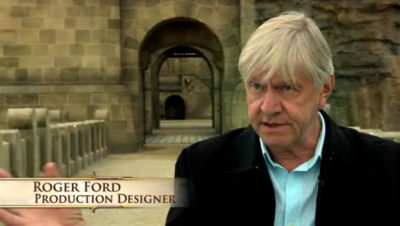
“So, in a sense, when we tried to develop the exterior of the castle, I'm trying to put a character into the movie and make it reflect the Telmarine culture. It's imposing in
its own right.” George Miller and Roger Ford
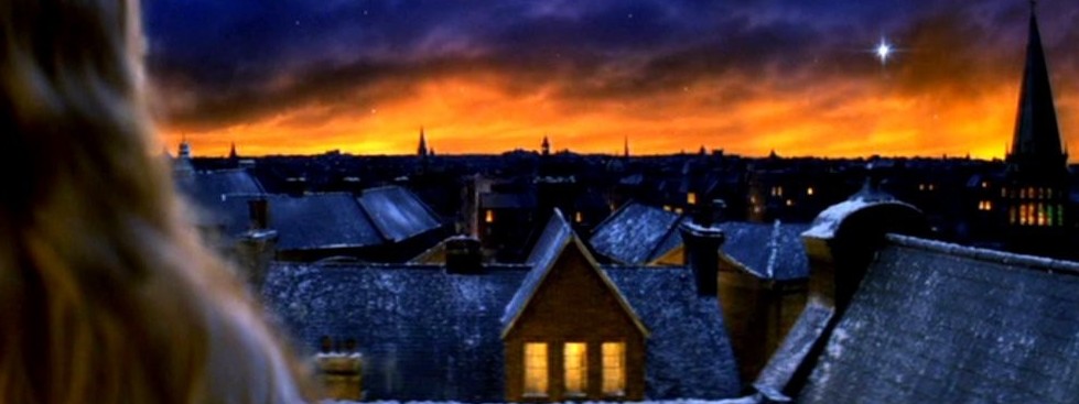
Here are some examples of work by the Production Designer Roger Ford. I am particularly interested in his work he did on Narnia: The Lion the Witch and the Wardrobe, Narnia: Prince Caspian and Peter Pan.
I find his set designs for the Narnia films very creative and just seeing images of them gets my imagination excited. He mixes the ethereal snow covered forests with the ice laden palace of the white witch to produce an incredibly diverse setting for a classic children’s story. He was nominated for the Excellence in Filmmaking award by the 2006 Australian Film Institute and the film The Lion the Witch and the Wardrobe won Best Family Film in 2006 at the Broadcast film Critics Association Awards.
The above link is a short documentary by Empire Magazine, looking around Pixar Animation Studio in Emeryville, California. Chris Hewitt interviews some of the members of Pixar who were involved in their latest release UP, including Pete Doctor who was the Director and Screenwriter.
I am a huge fan of all things Pixar and it is my dream to one day work for these giants of animation magic.
This video is an interview from the 2011 San Diego Comic-Con,with John Myhre who was the Production Designer on “Pirates of the Caribbean: On Stranger Tides”.
He starts off by briefly explaining what his role was as production designer was in the film and how exciting and creative this job is. It’s so good to see someone really enamoured with their work and as this is the job I want to go into one day it’s really inspiring and fills me with excitement and anticipation for projects I may get to work on one day.
It’s an interesting video because Myhre goes into detail on how he came up with the concept for the ship sailed by the infamous pirate Blackbeard, the Queen Anne’s Revenge. Many details go unnoticed by the audience but it’s very interesting hearing where certain elements of the design come from; for example the menacing skeleton on the bow of the ship where the figurehead should be, holding a spear and a goblet, is taken from motif that appears on Blackbeard’s flag: